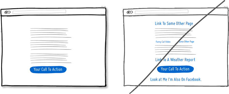
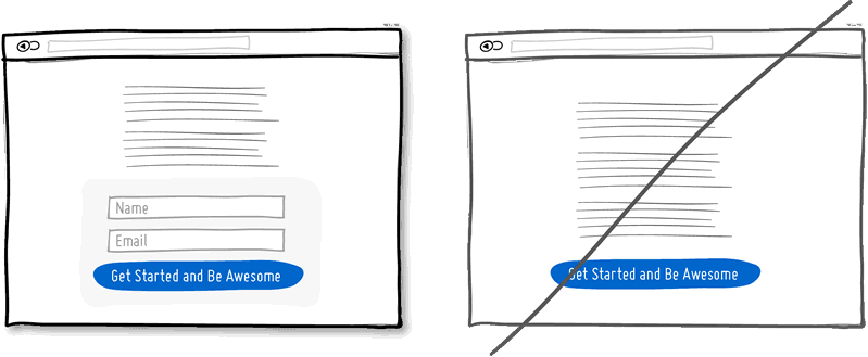
16. 링크 도배보다는 집중하게 하라
가능한 많은 유저들의 요구에 맞추기위해 좌든 우든 페이지에 링크를 많이 달기는 쉽다. 하지만 당신이 Bottom에 반응을 요구하는 의도의 서술적 페이지를 만든다면 두번 생각해라. 페이지내의 많은 링크들은 당신이 반응하길 원하는 것에 고객이 집중할수없게 만들것이다. 중요한 버튼에 도달할 누군가의 확률을 높이는 확실할 방법은 주제와 관련없는 링크를 없애는 것이다.
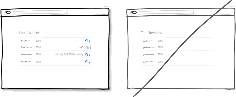
17. 현재 상태를 보여주려고 애써라
UI에서 이메일의 읽음/읽지않음, 또는 청구서의 결재완료/미납등과 같이 현재의 서로 다른 상황을 보여주는 요소들을 매우 자주 볼수있을 것이다. 한 아이템의 특정한 상태를 사용자에게 알려주는 것은 피드백을 제공하는 좋은 방법이다. 현재 상황를 알려주는 것은 사용자들이 무언가 액션을 취해야한다는 것 뿐아니라 이전에 취한 액션이 성공적이었는지 아닌지 쉽게 이해할수있다.
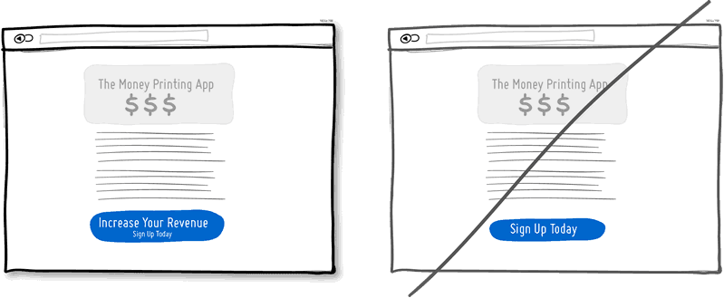
18. 그냥 흔한 버튼보다는 버튼에 혜택이 있음을 알려라
한 페이지에 보이는 두개의 간단한 버튼을 생각해보자. 하나는 "돈을 아낄수있음" 이라고 적혀있고 다른 하나는 "가입하기"라고만 써있다. 나는 첫번째 버튼이 더 많이 이용될거라는데 내 중요한 거 두개를 건다. "가입하기"는 그 안에 내포된 어떠한 가치도 없는 주제에 그 절차는 어떠한 긴 양식을 채워야하는 노력이 필요하다. 무언가 혜택을 강조하는 버튼은 더높은 회원가입을 이끌거라는 가정에 기초하며, 반대로 그 혜택은 또한 왜 사람들이 그 액션의 취해야하는지 상기시키기 위해 해당 액션 버튼 인근에 배치할수도 있다. 물논 그 흔한 버튼들이 존재할 이유는 충분하지만 어디까지나 무언가 설득할 필요없이 명확하고 반복적으로 사용되는 곳에 적합하다.
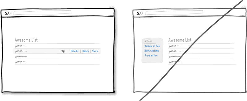
19. 연관성 없는 메뉴를 거치지않고 그 즉시 편집가능하게 하라
간혹 연관성이 없는 일반적인 액션들을 나열해두는 것보단 해당 요소들에서 바로 액션을 가능하게 만드는게 이해하기 쉽습니다. 예를 들어, 데이터의 리스트를 보여줄때, 우리는 보통 사용자에게 리스트의 해당 아이템내에서 무언가 하도록 만드려고 합니다 - 이 리스트내에서 클릭 또는 호버(마우스를 올려놓는것)를 통해 해당 아이템의 삭제, 이름변경 등과 같은 편집이 가능하게 할수 있습니다.
또 다른 즉시 편집의 흔한 예로, 한 (주소데이터와 같은) 아이템을 클릭하면 편집가능한 입력폼으로 바꾸어 주는것입니다. 이러한 상호작용을 통해 연관성이 없는 메뉴를 거쳐 동일한 일을 하는 것보다 필요한 과정을 줄이는 것이 가능합니다 (일단 해당 아이템이 이미 선택이 되어 있으므로). 물론 일반적으로 아이템을 선택할 필요가 없다면 연관성없는 메뉴를 쓰는데 전혀 지장이 없습니다.
짬짬이 진행중이나 개인적으로 요새 시간이 안나므로 혹시 이후가 궁금하신분들은
두두리이님께서 알려주신 링크로 대체합니다 두두리이(http://doodoori2.tistory.com/)님 감사합니다
https://docs.google.com/presentation/d/14KJfuZiTL1VKt5U5N0jIgdoF76_FJhjVSPvP3lJLMC8/edit#slide=id.p
개인적으로는 이렇게 친절한 문구를 안좋아라해서 시간나는대로 번역을 하나씩 늘려갈생각입니다
20. Try Exposing Fields instead of creating extra pages
When creating landing pages that convey value, it can be beneficial to show the actual form fields on the conversion page itself. Merging the sign up form with the landing page comes with a number of benefits in comparison to creating separate multi-page sign ups. First, we are cutting out extra steps from the flow in general and the task at hand takes less time. Secondly, by showing the number of form fields right there, we are also providing the customer with a sense of how long the sign up actually is. This of course is a little easier when our forms are shorter in the first place (which of course they should be if possible).
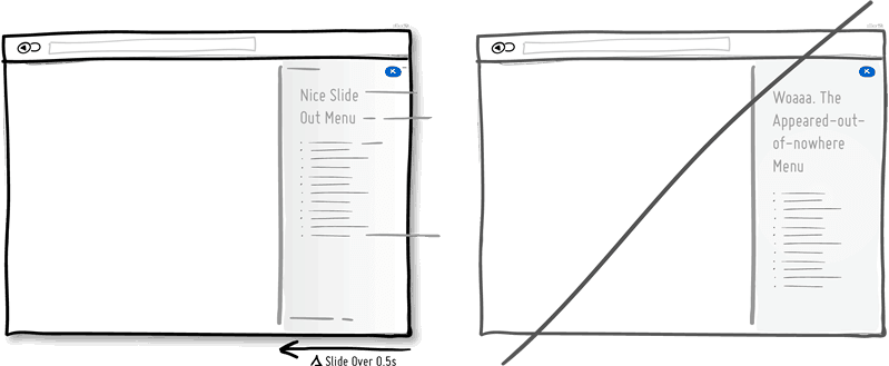
21. Try Transitions instead of showing changes instantly.
Interface elements often appear, hide, move, shift, and resize as users do their thing. As elements respond to our interactions, it sometimes is a little easier to comprehend what just happened when we sprinkle in the element of time. A built in intentional delay in the form of an animation or transition, respects cognition and gives people the required time to understand a change in size or position. Keep in mind of course that as we start increasing the duration of such transitions beyond 0.5 seconds, there will be situations where people might start feeling the pain. For those who just wish to get things done quickly, too long of a delay of course can be a burden.
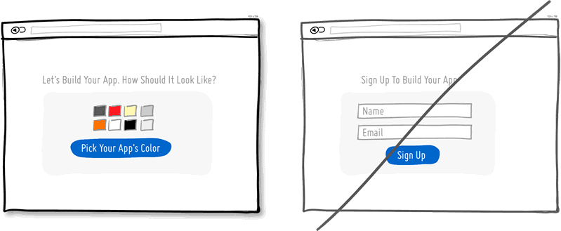
22. Try Gradual Engagement instead of a hasty sign up.
Instead of asking visitors to sign up immediately, why not ask them to first perform a task through which something of value is demonstrated. During such initial interactions the product can both show off its benefits, as well as can lend itself to personalization. Once users begin to see your product’s value and see how they can make it their own, they will then be more open to sharing with you additional information. Gradual engagement is really a way to postpone the sign up process as much as possible and still allow users to use and customize your application or product.
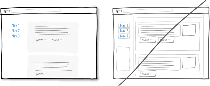
23. Try Fewer Borders instead of wasting attention.
Borders compete for attention with real content. Attention of course is a precious resource since we can only grasp so much at any given time. Surely borders can be used to define a space very clearly and precisely, but they also do cost us cognitive energy as they are perceived as explicit lines. In order to define relationships between screen elements which use less attention, elements can also be just grouped together through proximity, be aligned, have distinct backgrounds, or even just share a similar typographic style. When working in abstract UI tools, it’s easy to drop a bunch of boxes everywhere. Boxes however come with a false sense of being immune from the order and unity which governs the rest of the screen. Hence pages with lots of boxes sometimes may tend to look noisy or misaligned. Sometimes it is helpful to throw in a line here and there, but do consider alternative ways of defining visual relationships that are less taxing to attention and your content will come through.
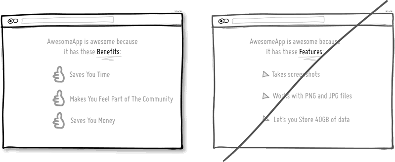
24. Try Selling Benefits instead of features.
I
think this is Marketing 101. People tend to care less about features
than they do about benefits. Benefits carry with them more clearly
defined value. Chris Guillebeau in "The $100 Startup" writes that people
really care about having more of: Love, Money, Acceptance and Free
Time, while at the same time wishing for less Stress, Conflict, Hassle
and Uncertainty. When showing features, and I do believe that there is
still room for them occasionally, be sure to tie them back to benefits
where possible.
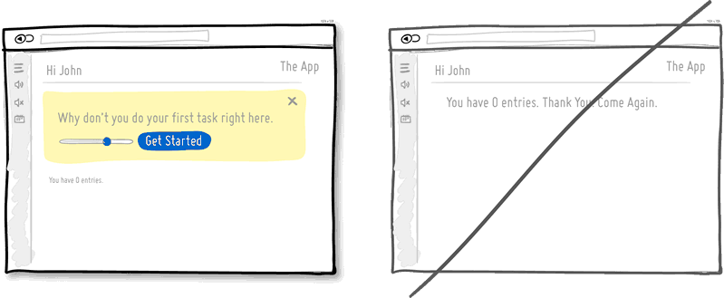
25. Try Designing For Zero Data instead of just data heavy cases.
There are cases when you will have 0, 1, 10, 100, or 10,000+ data results which might need to be displayed somehow in various ways. The most common of these scenarios is probably the transition from first time use with zero data towards future use with a lot more data. We often forget to design for this initial case when there is still nothing to display whatsoever, and by doing so we run the risk of neglecting users. A zero data world is a cold place. When first time users look at your app and all it does is show a blank slate without any guidance then you’re probably missing out on an opportunity. Zero data states are perfect candidates for getting users across the initial hurdle of learning by showing them what to do next. Good things scale and user interfaces are no exception.
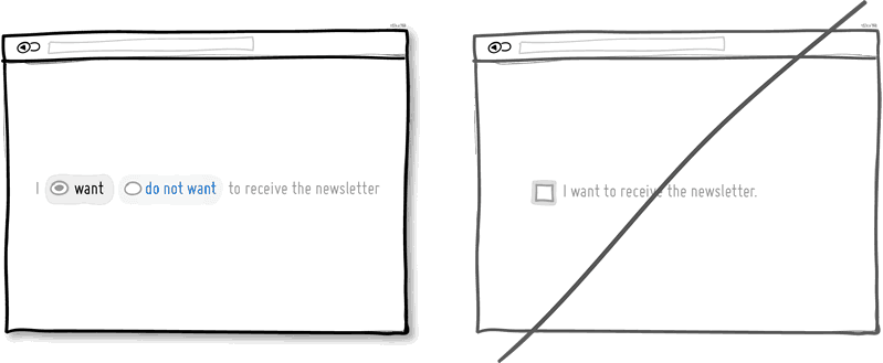
26. Try Opt-Out instead of opt-in
An opt-out strategy implies that users or customers are defaulted to take part in something without having to take any action. Alternatively, there is also the more traditional opt-in strategy that requires people to first take an action in order to take part in or receive something. There are two good reasons why opt-out works better than opt-in. First it alleviates resistance on the path of action, as the user does not have to do anything. Secondly, it’s also a form of recommendation which implies some kind of a norm - “since everyone else takes this as it is, I might also do the same”. Of course the opt-out strategy is often perceived as controversial as there are those sleazy marketers which will abuse it. One such evil is to diminish the readability of the opt-out text, while another is to use confusing text, such as double negatives. Both examples will result in users being less aware of actually signing up for something. Hence to keep the ethics in check, if you do decide to go with an opt-out approach, do make it very clear and understandable to your customers what they are being defaulted into. After all, this tactic has also been used in Europe to save lives.
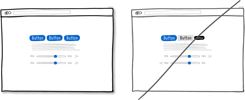
27. Try Consistency instead of making people relearn.
28. Try Smart Defaults instead of asking to do extra work.
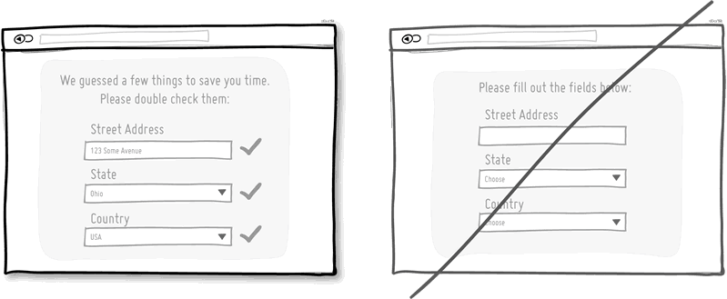
Using smart defaults or pre-filling form fields with educated guesses removes the amount of work users have to do. This is a common technique for helping users move through forms faster by being respectful of their limited time. One of the worst things from an experience and conversion stand point is to ask people for data that they have already provided in the past, repeatedly over and over again. Try to display fields that are preloaded with values to be validated as opposed to asking for values to be retyped each time. The less work, the better.
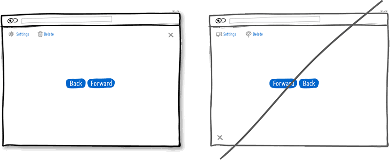
29. Try Conventions instead of reinventing the wheel.
Convention is the big brother of consistency. If we keep things similar across an interface, people won’t have to obviously struggle as hard. If on the other hand, we all keep things as similar as possible across multiple interfaces, that decreases the learning curve even further. With the help of established UI conventions we learn to close screen windows in the upper right hand corner (more often than not), or expect a certain look from our settings icons. Of course there will be times when a convention no longer serves purpose and gives way to a newer pattern. When breaking away, do make sure it’s purposefully thought out and with good intention.
30. Convention is the big brother of consistency.
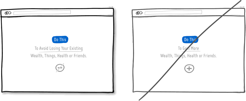
If we keep things similar Try Loss Aversion instead of emphasizing gains. We like to win, but we hate to lose. According to the rules of persuasive psychology, we are more likely to prefer avoiding losses than to acquiring gains. This can be applied to how product offerings are framed and communicated. By underlying that a product is protective of a customer’s existing well-being, wealth or social status, such strategy might be more effective than trying to provide a customer with something additional which they don’t already have. Do insurance companies sell the payout that can be gained after the accident or the protection of the things we hold dear to us?across an interface, people won’t have to obviously struggle as hard. If on the other hand, we all keep things as similar as possible across multiple interfaces, that decreases the learning curve even further. With the help of established UI conventions we learn to close screen windows in the upper right hand corner (more often than not), or expect a certain look from our settings icons. Of course there will be times when a convention no longer serves purpose and gives way to a newer pattern. When breaking away, do make sure it’s purposefully thought out and with good intention.
'구글링' 카테고리의 다른 글
| BitBucket 대 GitLab (0) | 2015.04.23 |
|---|---|
| 부트스트랩 Modal을 대체할만한 플러그인 7개 (0) | 2014.04.12 |
| 어서와 JSP, 타임리프는 처음이지? (부제: JSP는 무덤으로) (2) | 2013.07.16 |
| 최고의 반응형 CSS 프레임워크 18선 - 2013년 7월기준 (4) | 2013.07.13 |
| 바람직한 UI #1-15 (A Good User Interface) (13) | 2013.07.11 |

